Here’s how you make your PowerPoint presentation stand out – 6 tips
PowerPoint is a strange animal. It is everyone’s favorite punching bag, but making a good presentation is not really a question of tools. It requires creative skill, eye for design and even a sense of drama. From a visual point of view, most presentations have the same problems: different styles make the presentation incoherent and too many things are stuffed on one slide. Dividing your content across several slides and being consistent with your style in terms of font, color and illustration pave the way for a successful end product.
Tip 1: Use references for inspiration
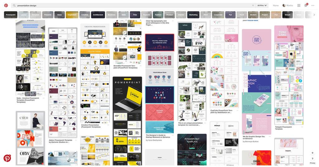
Don’t let PowerPoint kill your creativity just because it’s, well, PowerPoint. You’re using a visual tool that makes almost everything possible. If you’re looking for inspiration, references can get you off to a nice start. To get a good overview of the possibilities a blank PowerPoint presentation offers, go on Pinterest and search for ‘presentation design.’ If you find good references, you can save them on your computer or draw quick wireframes of your favorite layouts. This makes it easier to decide on a suitable layout while designing your own presentation.

Tip 2: Minimalism is the thing
We’ve all been there – a PowerPoint presentation where every possible thing is stuffed on the same slide. There’s no empty space on the slide, which makes it hard to read. Don’t go there. Ideally, you’ll keep it to one idea a slide. If that seems impossible, try to summarize and take things out as much as possible.
We’re talking about a presentation. Leave only the key points you want everyone to remember on the slides. You can always share the details in another form that’s easier to read, a text file for example. Don’t worry about splitting your content across multiple slides. Changing the slide is easy for you, but for your audience reading a slide full of small text fonts is like playing football on ice.
Forget about collecting a slide full of bullet points or diagrams that get mistaken for a hurricane. Try to concentrate on keywords or short sentences instead. Animations are a good way to organize subject matter into smaller chunks that take turns appearing on the slide. You can add or remove content with one click.

Tip 3: Pick a font that matches your presentation topic and keep the size big enough
Think about the relationship between the font and the theme of your presentation. If you want to showcase your professional expertise, don’t use Comic Sans. If you want it to have a personal touch, forget Calibri.
Remember to use a big enough font size, so everyone even in the back row can read it. If you end up using a smaller font than you first intended to fit more content on a slide, you have too much text.
It’s also worth remembering that different computers use different font libraries. This can be a problem when PowerPoint presentations get sent between people. If you use different computers to create and present, take time to ensure the fonts work properly. PC users can embed fonts to a presentation, and they should work fine if opened on another PC. Of course, there’s nothing stopping you from exporting the presentation to PDF format, which should work on all computers.
Tip 4: Be creative with the layout
Headline in the top left corner and a few bullet points under it – this description covers 80 percent of all PowerPoint slides ever created. To stand out, try new ways of placing elements. Don’t get stuck in one style.
How about using a full-page cover picture that only has one keyword on it? Or one keyword or sentence that is centered or written in a deliberately big font? Surprises and contrast make your presentation interesting. If you use pictures, try placing them inside a square or a circle for a change instead of putting them on the right as a rectangle.
Tip 5: Use illustration if it adds value to the presentation
Should your presentation have images or not? It depends. Some presentations that only use single keywords can be extremely interesting. However, illustration can often enliven a presentation and sometimes adding illustration is very necessary to make the content clearer.
Try to find surprising images instead of opting for safe bets. What is your theme and subject? What springs to mind if you try to express the themes in a picture? Forget about the first thing that comes to mind and dig a little deeper to find a more insightful illustration option. The images don’t necessarily have to be figurative. Abstract colors and forms can also help create fascinating illustrations.

Tip 6: Animate if necessary
With animation you can create cool effects or, alternatively, mild secondhand embarrassment. Sometimes these two reactions are simultaneous. In any case, you have to determine the need for animation for each presentation and slide separately. Optimally they give the presentation a nice finishing touch and help the transition from one subject to another. Just keep in mind that animation easily makes the presentation tacky.
Check these things as well:
- Check color contrast. Can you read the grey text on a white screen? Even with the client’s equipment that is different from yours?
- Is the image resolution good enough? Even on a big screen?
- Compress the images so you don’t clog the recipient’s inbox.
- You didn’t put too many things on one slide, did you?


